What is Rhythm in Interior Design?
What is Rhythm in Interior Design? Simple Secrets for a Harmonious Home
(Learn 5 Professional Techniques to Create Flow + Avoid Clutter Chaos)
🔍 Rhythm Explained in 30 Seconds
Rhythm = Visual Flow
It’s the “hidden beat” that guides your eye smoothly around a room. Like music, great design uses patterns, contrasts, and surprises to create a space that feels calm yet interesting.
Broken Rhythm Warning Sign:
“I like everything in my room separately, but together it feels… off.”
🎨 5 Types of Rhythm (With Easy Examples)
| Type | How It Works | Real Room Example |
|---|---|---|
| Repetition | Repeat colors/shapes (e.g., same pillow on sofa + rug pattern) |  |
| Progression | Gradual change (small → large frames; light → dark walls) |  |
| Contrast | Bold opposites (rough wood next to glossy metal; black chair in white room) |  |
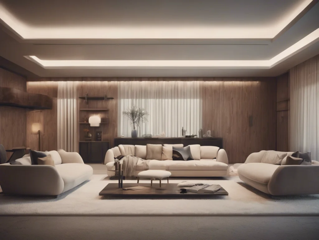
| Transition | Soft guides (arched doorway leading eye to window; curved sofa flow) |  |
| Radiation | Circle patterns (round table + chandelier + rug) |  |
✨ 2024 Trend: “Curved Rhythm” → Arches, oval rugs, and circular lights create modern flow.
🛠️ Fix Rhythm Mistakes: Pro Solutions
Problem 1: “My Room Feels Chaotic”
Cause: Too many colors/textures fighting
Fix: Pick ONE element to repeat:
- Repeat black accents (lamp base, frame, vase)
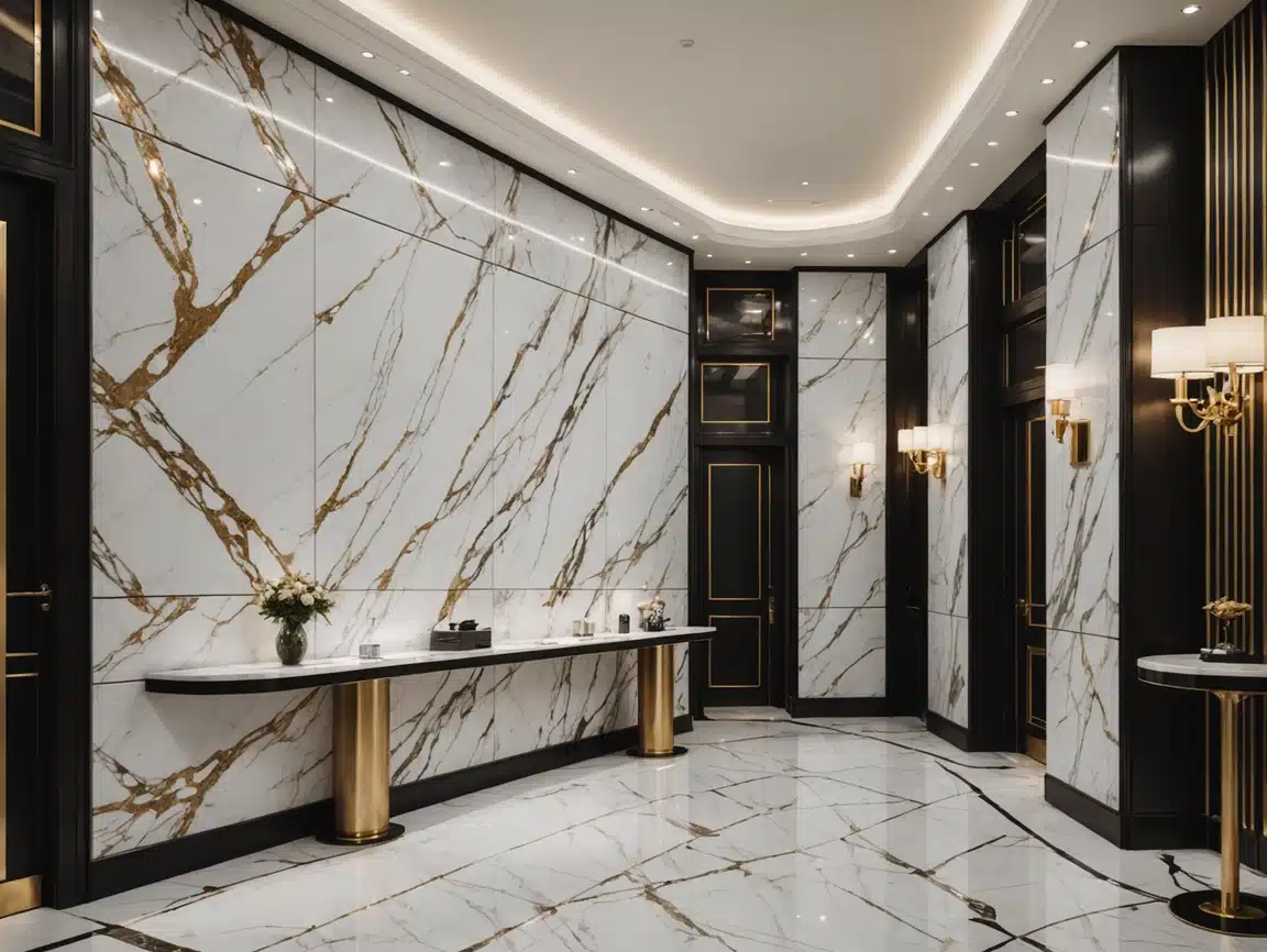
- Or use Witop’s matching wall panels + trim → creates instant pattern unity
Problem 2: “Eyes Get Stuck in Corners”
Cause: Poor visual pathways
Fix: Add transitions:
- Lay rug diagonally
- Hang curtain rod wider than window
- Position lights to “pull” gaze down hall
Problem 3: “Boring Hotel Room Vibe”
Cause: No surprises or contrast
Fix: Break repetition with ONE bold item:
- Red vase in neutral room
- Asymmetrical art cluster
- Oversized rattan pendant light
🧩 Rhythm Cheat Sheet for Common Rooms
| Room | Best Rhythm Type | Witop Product Pairing |
|---|---|---|
| Small Bedroom | Progression (light→dark walls) | Tone-on-tone wall panels |
| Open-Concept | Transition (rugs defining zones) | Large-format luxury vinyl planks |
| Narrow Hallway | Radiation (round mirror + ceiling medallion) | Circular LED ceiling panel |
| Cluttered Office | Repetition (matching storage boxes) | Coordinated desk + cabinet fronts |
✅ 3-Second Rhythm Check
Ask:
- Eyes move freely? (If stuck → add transition)
- Something repeats? (If no → repeat a color/texture)
- One ‘wow’ moment? (If missing → add contrast)
💡 Tip: Snap a photo → draw lines showing eye paths. Fix dead ends!
💼 Real Designer Tricks
- 60-30-10 Rule:
60% dominant color → 30% secondary → 10% pop - Texture Flow:
Rough ➔ Smooth ➔ Shiny (like stone wall → linen sofa → chrome lamp) - “Frame Within Frame” Trick:
Layer arches (doorway → mirror → cabinet) to pull view inward
⚠️ Over-Rhythm Danger
Too much repetition = Boring!
- Break identical chairs with different cushions
- Mix paneling directions (e.g., Witop vertical bathroom panels + horizontal kitchen backsplash)
🖼️ Before & After: Rhythm Rescue
Cluttered Living Room → Serene Oasis
| Before | After |
|---|---|
| ❌ Chaotic art wall | ✅ Repeat frame styles/colors |
| ❌ Furniture shoved to walls | ✅ Float sofa to create pathways |
| ❌ 4 clashing wood tones | ✅ Unified wood + black metal |
🌟 Start Today
- Audit 1 room using photo test.
- Add one transition piece (rug/lamp/plant).
- Edit clutter—remove items breaking flow.
“Used Witop’s matching panels in my kitchen nook. Suddenly the whole room ‘sings’!”
— Leah R., Verified Customer
Ready to create rhythm?[🎯 Take Witop’s Free Room Flow Quiz] → Get custom solutions in 2 mins!
(Design glossary: Rhythm = Creating patterns to delight the eye without overloading it.)
Free samples
In recent years, composite products have become more and more popular all over the world. We believe you will also be interested in this new material. If you are interested, you can come to consult us. We have a professional service team that can not only answer any questions you may have but also provide you with free samples. Let you better understand the composite products. There is no doubt that composite wall panels will be the new future.
Share

James is a content creator and decorator with five years of experience designing home decor. In his daily life, james is constantly on the lookout for the latest, great examples of house design and further optimizes his solutions. Additionally, he writes articles related to outdoor design, interior design, and architectural decorating materials to help brands build more engaging relationships with their audiences.